momox SE
momox Refresh
Momox Refresh was a visual redesign of the momox website, mobile app and branding.
- Year
- 2021–2025
- Role
- Team Lead Graphic · UI Design
- Scope
- Visual Design · UI · Web & App
- Programs used
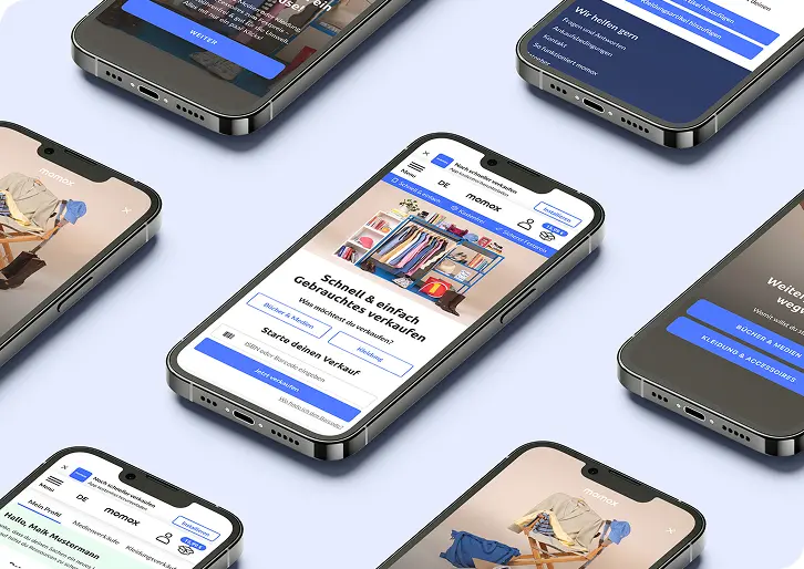
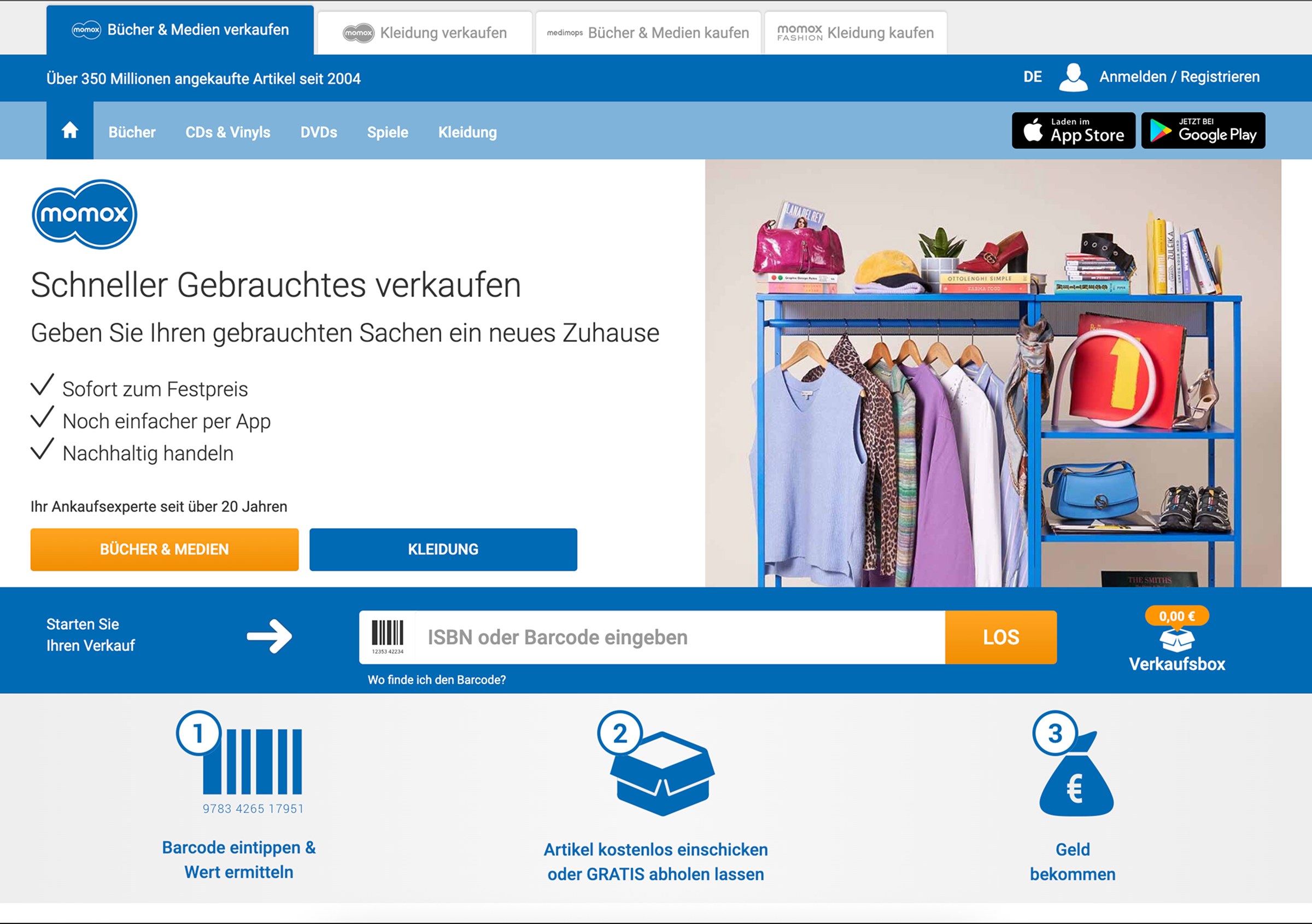
The redesign resulted in a modern and visually refreshed experience that maintains familiar structures and workflows, allowing users to navigate the platform intuitively while benefiting from improved clarity, consistency, and a more contemporary brand appearance.
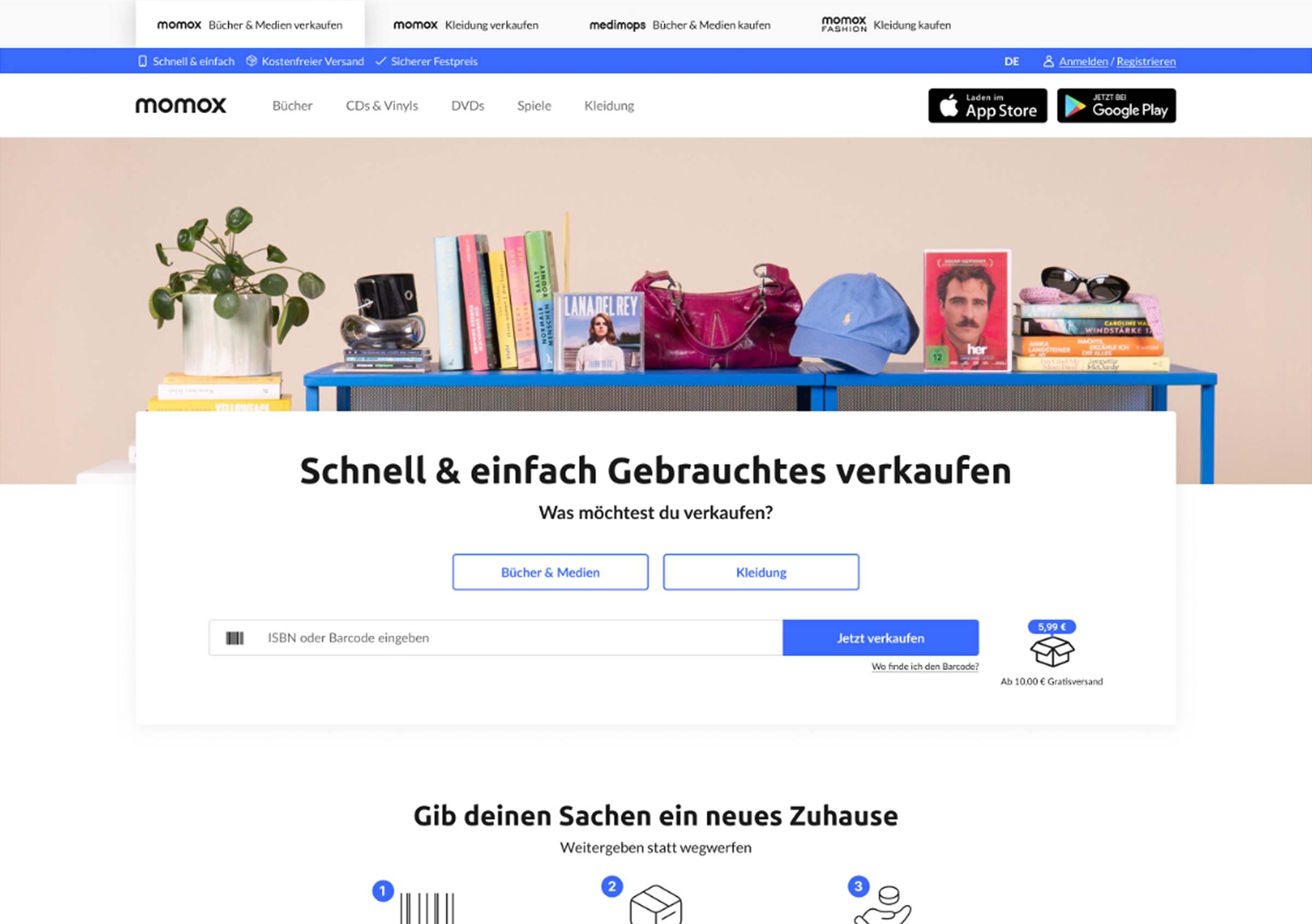
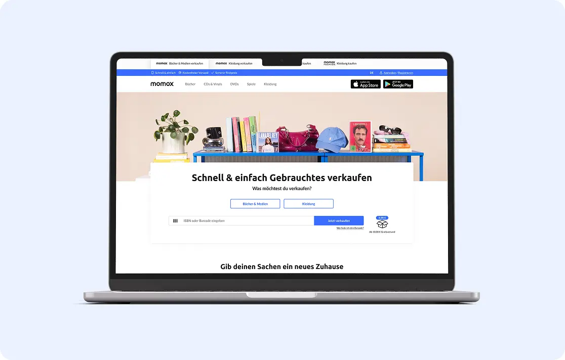
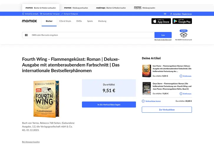
Before
After
Challenge
- The existing design lacked visual hierarchy and clear structure.
- Users struggled to navigate key features efficiently.
- Inconsistent typography and spacing reduced overall clarity.
- Important information was not immediately visible or easy to access.
- The interface did not scale well across different screen sizes.
Goal / Objective
- Improve overall usability and navigation clarity.
- Create a more consistent and cohesive visual system.
- Enhance readability and visual hierarchy.
- Design an interface that feels intuitive and accessible.
Solution
- Reworked the information architecture to improve navigation flow.
- Introduced a clear layout system with consistent spacing and alignment.
- Defined a cohesive typography and color system.
- Simplified UI components to reduce visual noise.
- Designed responsive layouts for different devices and screen sizes.