momox SE
momox biz Refresh
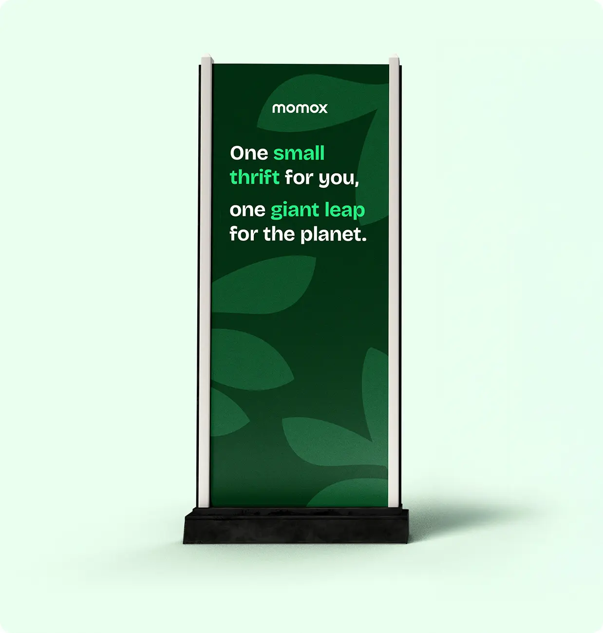
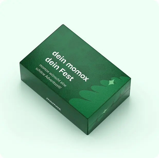
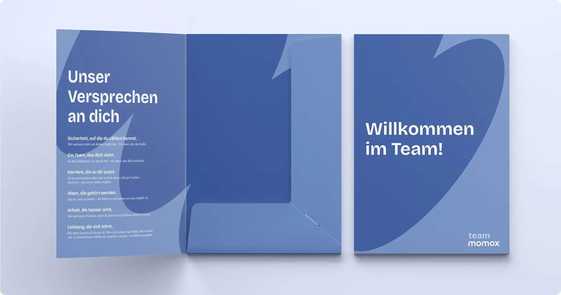
The momox biz Refresh was a redesign of the corporate branding for momox as an employer brand.
- Year
- 2025
- Role
- Graphic Design
- Scope
- Corporate Design
- Programs used


The project aimed to clearly distinguish momox as an employer brand from the consumer-facing sales platform while creating a more modern and structured visual identity.

Challenge
- momox needed to be clearly recognizable as an employer brand, separate from its sales platform.
- The existing design lacked clear rules and consistency across applications.
Goal / Objective
- Create a fresh and modern employer brand identity.
- Clearly differentiate momox biz from the consumer-facing brand.
- Establish clear design guidelines to ensure consistency and simplicity.
- Reduce ad-hoc design requests by defining a strong and scalable visual system.
Solution
- Introduced a new typeface used exclusively for momox biz to strengthen brand distinction.
- Developed a clean and reduced visual design system.
- Updated the color palette to feel fresher and more contemporary.
- Replaced arbitrary illustrations with a defined set of abstract shapes or cut-out image elements to ensure visual consistency.